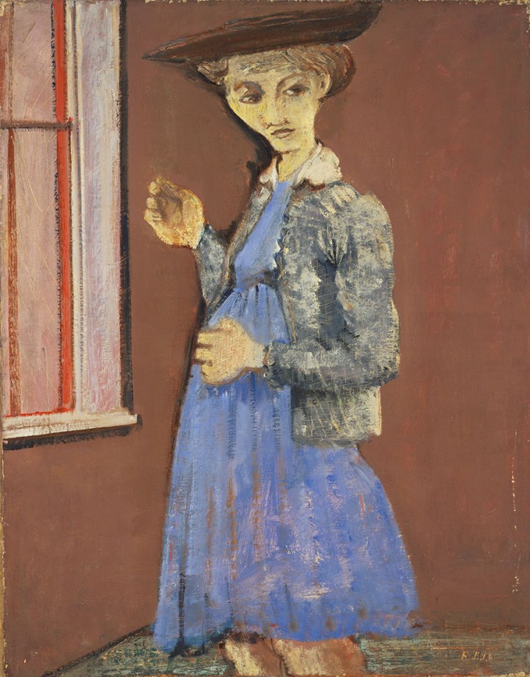
In The Panel of the Lions we saw that Paleolithic artists chose to represent a scene from the world around them. They carefully observed the appearance and behavior of the animals, and then they captured them in great detail on the cave wall. As you may have noticed, Violet, Black, Orange, Yellow on White, and Red is a very different situation. In this work by Mark Rothko, we find a type of art that allows us to see with our minds what we cannot see with our eyes: abstract painting. To be honest, I felt a little nervous when I decided to write about this work, as I am aware of abstract art’s bad reputation. However, I personally believe that this type of painting is the best if you want to discover new parts of yourself. I think it would be a tragedy to ignore it.
I have to admit that the first few times I came across abstract art, I didn’t know what to do with the painting or with myself. I felt uncomfortable and confused, because one glance was not enough for me to know what the painting was about. It was ridiculous to me that something so «basic» could be called art. Where are the people, the landscape and the buildings? Yes, the colors are quite pretty, but does it even mean anything? If these shapes look like nothing real, does it mean that the painting is about «nothing»? What is the story behind this painting and why don’t I understand it? Younger me was in crisis because, for the first time, when she wanted to talk to a work of art, she was met with absolute silence.
What took me a long time to understand is that abstract art cannot talk to us in the same way as the paintings we are used to. In this case, art addresses a «primitive» part of our existence, a part of our humanity that experiences life without words or even rational thought.
Abstract art has been around since the very beginnings of Painting, so there are many types of abstract art. An African artist from the Upper Paleolithic had a very different context and intentions than a European artist of the 20th century, so the results are different. However, generally speaking, the purpose of an abstract artwork is not to faithfully imitate reality but to provide viewers with an intangible and emotional experience. To do so, it makes use of the pure elements, such as line, shape, texture, color, and composition. Abstract art does not necessarily mean something specific. Instead, it gives you the freedom to choose whatever you want it to mean to you. To appreciate an abstract painting, we have to have an open and inquisitive mind; we have to let ourselves be drawn into the painting and see where it takes us.

However, I understand that this is easier said than done, so we will go step by step. Please don’t run away from me yet. I know this blog would be pretty useless if the only thing I did was tell you that you have to «feel» the painting, without further explanation.
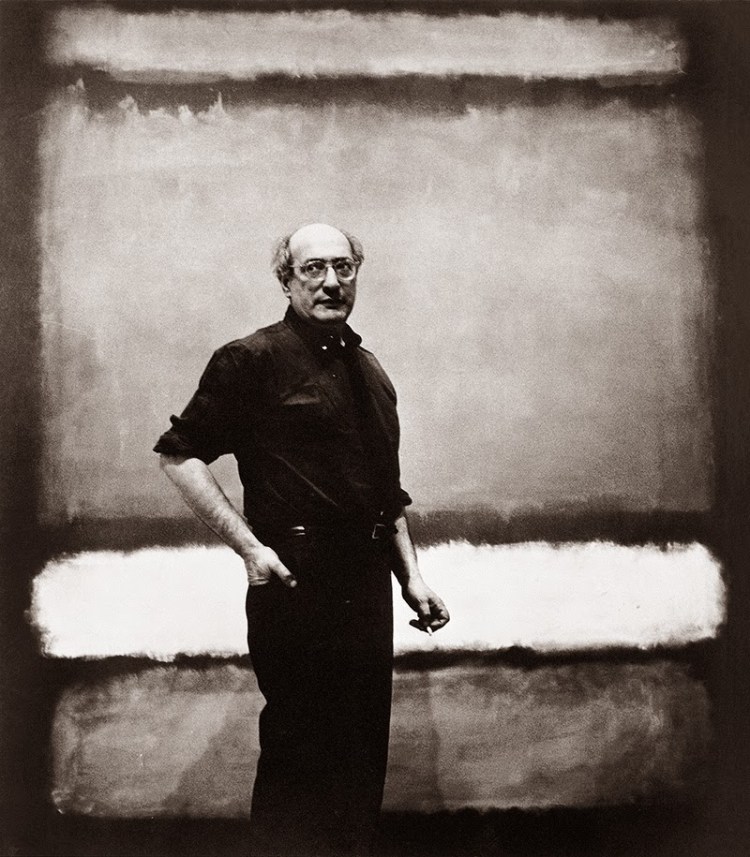
So let’s start with a bit of context. Today, we will focus on the movement called Abstract Expressionism because Mark Rothko, the author of Violet, Black, Orange, Yellow on White and Red, was part of it. Abstract Expressionists emerged in the United States in the years following World War II. As you can imagine, the art world did not escape the horrors of war. Barnet Newman, another artist associated with the movement, wrote: “We felt the moral crisis of a world in ruins, a world destroyed by a great depression and a fierce World War, and at that time it was impossible to paint the kind of paintings that we had been doing: flowers, reclining nudes and people playing the cello” [1]. For the Abstract Expressionists, following the artistic tradition became “irrelevant and irresponsible” [2].
It is very common for artists to be attracted to philosophical currents. Abstract Expressionists sympathized with the existentialism of Martin Heidegger and Jean-Paul Sartre. They believed that a painting could serve as a perpetual mark of a person’s existence. They were also influenced by the ideas of the Swiss psychologist Carl Jung [3]. They thought that their subjects were not «abstract», but rather primitive images, which are profoundly rooted in the collective unconscious of society. Their purpose was to communicate universal truths about the human condition.
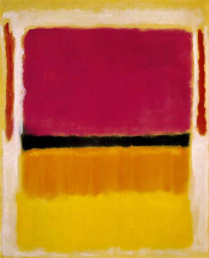
Now that we have dipped our toes into Abstract Expressionism, let’s talk about the painting. The first thing we notice are the bright colors: purple, black, orange, yellow, white and red. Usually, the color in a painting depends on the narrative content – think of an image of the Crucifixion of Jesus, for example. The blood will be red, the cross will be brown, the nails will be black, there will be areas that require darker colors for the shadows, others that require lighter and brighter colors to generate depth, and so on. First, the story and the different elements (such as shapes and characters and mood) are defined, and only after that, the artist chooses the colors, depending on what the work requires. However, on this painting we find that color has a leading role. Color not only comes before anything else, but it is everything. This story without words begins and ends with color.

Taking into account that we cannot talk about all the possible meanings of each element, and that, even if we did, it would not be a complete be-all and end-all analysis, let’s talk about colors. I’ll start with violet. To be honest, it looks more pink than violet to me, but the painting was named by people who have actually seen it in person, so we’ll treat it as violet. This color, due to its intensity and how difficult it is to achieve, was used throughout the history of art to represent important figures – usually religious and royal figures -, as well as splendor, the union of opposites, and eternity. No person appears in this work, and obviously, you cannot «paint» eternity; we only see the idea of it. Framing the violet rectangle, there are two red lines. On a symbolic level, red is the color of life, it represents human relationship with blood and fire. Red is associated with heat, vitality, danger, sexuality and fury. It is important to note that the red lines are parallel. In art, parallel lines are considered balanced and harmonious and involve endless, continuous movement. Have you ever noticed that parallel lines can always be found in churches?


Splitting the painting in half and balancing the composition, we have a black line / black rectangle. The color black is like a cave and an abyss. It is associated with melancholy, mourning, the unknown and chaos … but it is also associated with introspection, with the purification of emotions and the understanding of oneself. At the bottom of the painting we have an orange and a yellow rectangle. These two warm colors remind us of the Sun, the sky and happiness. Finally, around all these rectangles we have white, which is usually associated with purity, infinity, and silence.

I don’t ever want to say: «this is the only explanation for this painting». Abstract art doesn’t work that way, as I mentioned at the beginning. This is just one of many interpretations, my interpretation. In Violet, black, orange, yellow on white and red we find the ideas of eternity, life, abyss, happiness, melancholy, purity … all within a perfectly balanced and symmetrical composition. It would be very easy to say: «Anyone can paint colored rectangles, and it doesn’t have to mean anything». However, I would like to suggest that you try to put together the ideas that we have seen so far, and that you try to decipher what it means to you. It always amazes me, for example, that the red-blood of life contains the concept of eternity. It reminds me of the poem Auguries of Innocence, by William Blake: “See a World in a Grain of Sand / and a Sky in a Wild Flower; / hold the Infinite in the palm of your hand / and Eternity in one hour”.
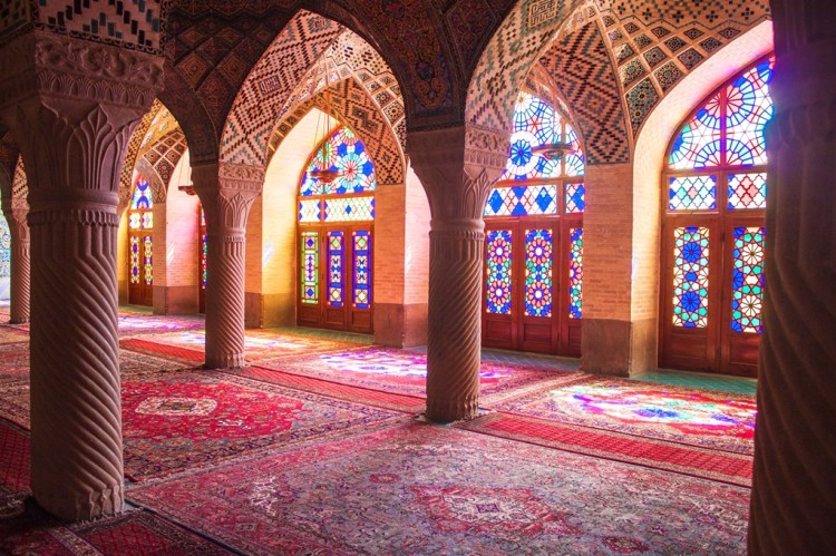
Something very interesting about Rothko’s paintings, and something that is not obvious when viewing them on a screen, is that they are very large, often larger than a human being. This painting measures 207 x 167.6 cm or 81 1/2 x 66 inches. Throughout the history of art, monumental painting was usually reserved for religious motifs, landscapes, war scenes, and royal figures. Paintings with these themes were supposed to inspire awe and reverence, and one way to achieve this was by forcing the viewer to look up. A monumental work, especially in the religious sphere, can easily communicate the message: “the idea represented in me is bigger than you”. This can be both negative and positive. In Gothic cathedrals (as in the image of Saint Denis Cathedral, above), the huge stained-glass windows atop the building served, among other things, to illuminate the place with God’s light. By doing this, spectators would be amazed and feel comforted by a higher power. What does it tell us that in this painting, with so many similarities to religious art, the saints and kings and rules have disappeared? What does it mean that we have no choice but to unravel, from the depths of our beings, what we see inside of the painting? The painting has no title. Violet, black, orange, yellow on white and red is just a name chosen so that we don’t get confused with all the other paintings by the same author… Was Rothko bad at naming his paintings? Or would choosing a title to define it go against its purpose?
[1] Barnett Newman, “Response to the Reverend Thomas F. Mathews,” in Revelation, Place and Symbol (Journal of the First Congress on Religion, Architecture and the Visual Arts), 1969
[2] Abstract Expressionism, an introduction: https://www.khanacademy.org/humanities/art-1010/post-war-american-art/abex/a/abstract-expressionism-an-introduction
[3] Carl Jung believed that there are archetypes that make up a collective unconscious, much deeper than the personal unconscious, and that they are patterns of recurring images and symbols that appear in different forms in all cultures.
Original version in Spanish: https://acercatealapintura.com/2021/05/12/violeta-negro-naranja-amarillo-sobre-blanco-y-rojo/
Translation is mine ❀
